
Stop Fighting the Framework
A pattern I see constantly in SwiftUI code is manually creating icon-only buttons by putting an Image directly inside a Button‘s label closure. It works visually, but it throws away accessibility information and fights against SwiftUI’s design.
The Wrong Way
Button {
   toggleSidebar()
} label: {
   Image(systemName: "sidebar.left")
}
This renders a tappable icon, but VoiceOver has no meaningful label to announce. The user hears something like “button” or the raw SF Symbol name, which is not helpful.
The Right Way
Button("Toggle Sidebar", systemImage: "sidebar.left") {
   toggleSidebar()
}
.labelStyle(.iconOnly)
Or using Label explicitly:
Button(action: toggleSidebar) {
   Label("Toggle Sidebar", systemImage: "sidebar.left")
}
.labelStyle(.iconOnly)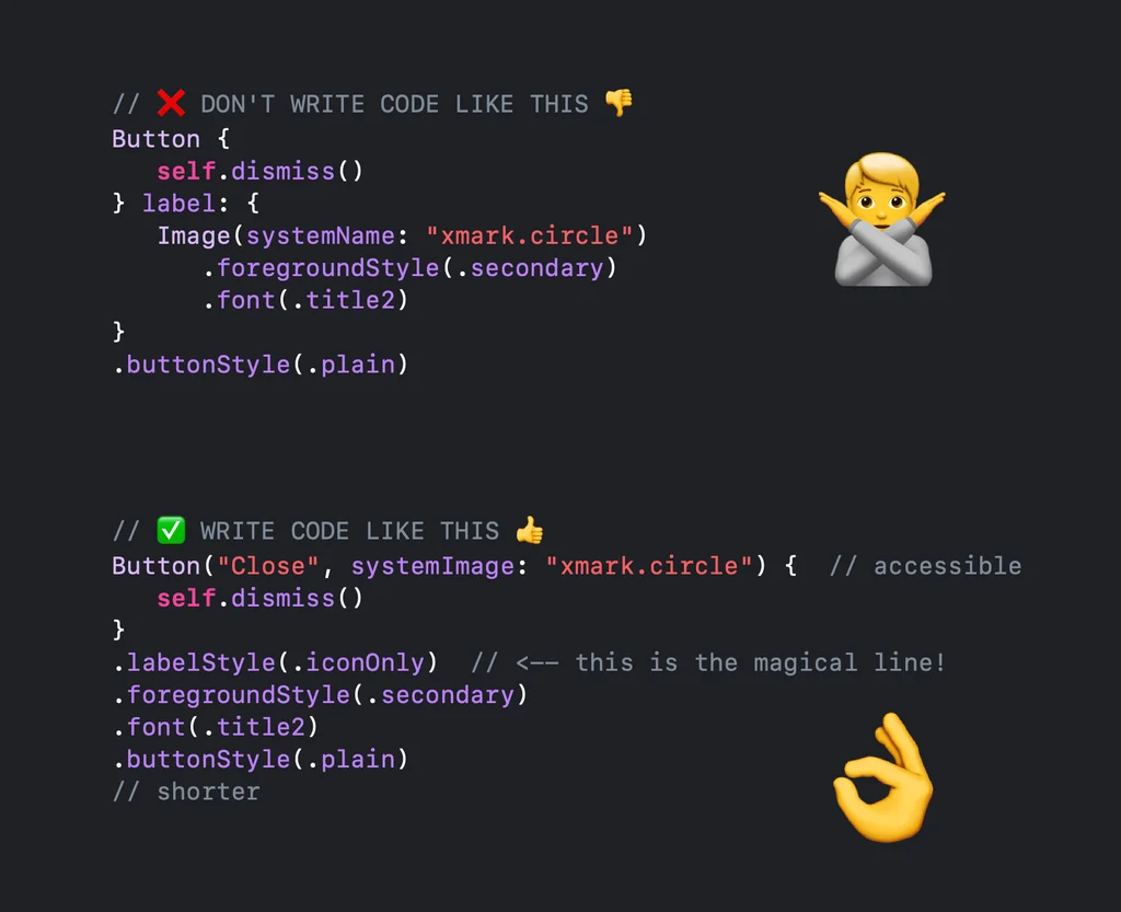
Why This Matters
The Label view carries both a title and an icon. When you apply .labelStyle(.iconOnly), SwiftUI hides the title visually but preserves it in the accessibility tree. VoiceOver will announce “Toggle Sidebar, button” – exactly what the user needs to hear.
This pattern also makes your code more adaptable. If you later decide to show text alongside the icon (for example, in a toolbar on iPad), you just change the label style to .titleAndIcon. No restructuring needed.
Beyond Buttons
The same principle applies to any view that accepts a Label: NavigationLink, Toggle, Picker, menu items. Whenever you are tempted to use a bare Image, ask yourself whether a Label with a style modifier would be more appropriate. In almost every case, it is.