HandySwiftUI View Modifiers: Streamlining Your SwiftUI Code
From smart color contrast and streamlined error handling to simplified deletion flows and platform-specific styling - discover the SwiftUI modifiers that eliminate common boilerplate code and help create more maintainable apps.

After 4 years of iterating on these APIs in my own apps, I'm happy to share the first tagged release of HandySwiftUI. This package contains various utilities and convenience APIs that were essential in helping me ship 10 apps in the past year alone. It provides conveniences for SwiftUI development similar to how my HandySwift package does for Foundation.
In this article, I'll share a selection of the view modifiers I've found most valuable in my daily development work across apps like TranslateKit, FreemiumKit, and CrossCraft. While HandySwiftUI contains many more utilities, these particular modifiers have proven their worth time and time again in real-world applications and could be helpful for your SwiftUI projects as well.
Smart Color Contrast
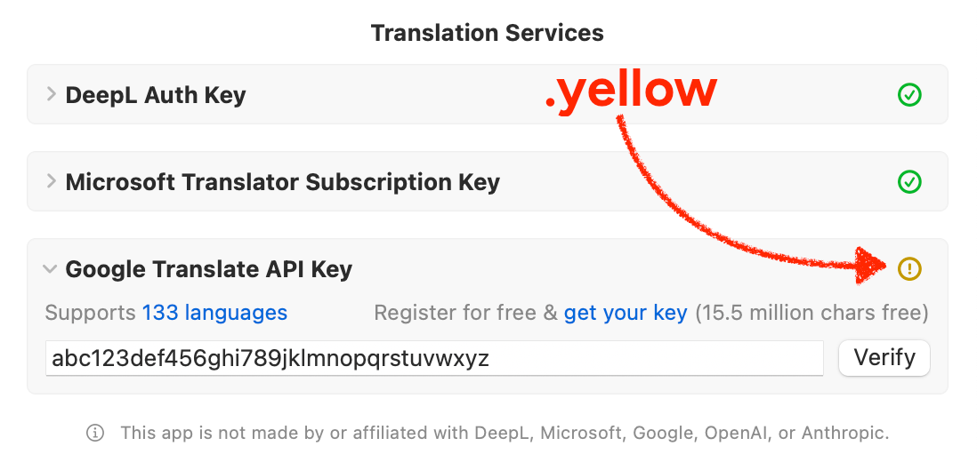
The foregroundStyle(_:minContrast:) modifier ensures text remains readable by automatically adjusting color contrast. This is useful for dynamic colors or system colors like .yellow that might have poor contrast in certain color schemes:
struct AdaptiveText: View {
    @State private var dynamicColor: Color = .yellow

    var body: some View {
        HStack {
            // Without contrast adjustment
            Text("Maybe hard to read")
                .foregroundStyle(dynamicColor)

            // With automatic contrast adjustment
            Text("Always readable")
                .foregroundStyle(dynamicColor, minContrast: 0.5)
        }
    }
}

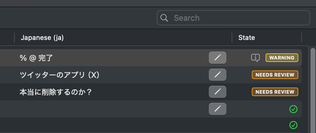
This warning indicator in TranslateKit uses .yellow but ensures a good contrast even in light mode to be legible. It stays yellow in dark mode.The minContrast parameter (ranging from 0 to 1) determines the minimum contrast ratio against either white (in light mode) or black (in dark mode) using the luminance value (perceived brightness). This ensures text stays readable regardless of the current color scheme.
Error-Handling Tasks
The throwingTask modifier streamlines async error handling in SwiftUI views. Unlike SwiftUI's built-in .task modifier which requires manual do-catch blocks, throwingTask provides a dedicated error handler closure:
struct DataView: View {
    @State private var error: Error?

    var body: some View {
        ContentView()
            .throwingTask {
                try await loadData()
            } catchError: { error in
                self.error = error
            }
    }
}
The task behaves similarly to .task – starting when the view appears and canceling when it disappears. The catchError closure is optional, so you can omit it if you don't need to handle errors, filling the gap the task modifier left open.
Platform-Specific Styling
A full set of platform modifiers enables precise control over multi-platform UI:
struct AdaptiveInterface: View {
    var body: some View {
        ContentView()
            // Add padding only on macOS
            .macOSOnlyPadding(.all, 20)
            // Platform-specific styles
            .macOSOnly { $0.frame(minWidth: 800) }
            .iOSOnly { $0.navigationViewStyle(.stack) }
    }
}
The example showcases modifiers for platform-specific styling:
.macOSOnlyPaddingadds padding only on macOS where containers likeFormlack default padding.macOSOnlyFramesets minimum window sizes needed on macOS- Platform modifiers (
.iOSOnly,.macOSOnly,.iOSExcluded, etc.) available for iOS, macOS, tvOS, visionOS, and watchOS allow selective application of view modifications on specific platforms
These modifiers help create platform-appropriate interfaces while keeping the code clean and maintainable.
Border with Corner Radius
SwiftUI doesn't provide a straightforward way to add a border to a view with corner radius. The standard approach requires verbose overlay code that is hard to remember:
Text("Without HandySwiftUI")
    .padding()
    .overlay(
        RoundedRectangle(cornerRadius: 12)
            .strokeBorder(.blue, lineWidth: 2)
    )
HandySwiftUI simplifies this with a convenient border modifier:
Text("With HandySwiftUI")
    .padding()
    .roundedRectangleBorder(.blue, cornerRadius: 12, lineWidth: 2)

Badges in TranslateKit use this for rounded borders, for example.
Conditional Modifiers
A suite of modifiers for handling conditional view modifications cleanly:
struct DynamicContent: View {
    @State private var isEditMode = false
    @State private var accentColor: Color?

    var body: some View {
        ContentView()
            // Apply different modifiers based on condition
            .applyIf(isEditMode) {
                $0.overlay(EditingTools())
            } else: {
                $0.overlay(ViewingTools())
            }

            // Apply modifier only if optional exists
            .ifLet(accentColor) { view, color in
                view.tint(color)
            }
    }
}
The example demonstrates .applyIf which applies different view modifications based on a boolean condition, and .ifLet which works like Swift's if let statement – providing non-optional access to optional values inside its closure. Both modifiers help reduce boilerplate code in SwiftUI views.
App Lifecycle Handling
Respond to app state changes elegantly:
struct MediaPlayerView: View {
    @StateObject private var player = VideoPlayer()

    var body: some View {
        PlayerContent(player: player)
            .onAppResignActive {
                // Pause playback when app goes to background
                player.pause()
            }
            .onAppBecomeActive {
                // Resume state when app becomes active
                player.checkPlaybackState()
            }
    }
}
These modifiers work together to create a more fluid and maintainable SwiftUI development experience, reducing boilerplate code while enhancing the quality and consistency of your user interface.
Delete Confirmation Dialogs
SwiftUI's confirmation dialogs require repetitive boilerplate code for delete actions, especially when deleting items from a list:
struct TodoView: View {
    @State private var showDeleteConfirmation = false
    @State private var todos = ["Buy milk", "Walk dog"]
    @State private var todoToDelete: String?

    var body: some View {
        List {
            ForEach(todos, id: \.self) { todo in
                Text(todo)
                    .swipeActions {
                        Button("Delete", role: .destructive) {
                            todoToDelete = todo
                            showDeleteConfirmation = true
                        }
                    }
            }
        }
        .confirmationDialog("Are you sure?", isPresented: $showDeleteConfirmation) {
            Button("Delete", role: .destructive) {
                if let todo = todoToDelete {
                    todos.removeAll { $0 == todo }
                    todoToDelete = nil
                }
            }
            Button("Cancel", role: .cancel) {
                todoToDelete = nil
            }
        } message: {
            Text("This delete action cannot be undone. Continue?")
        }
    }
}
HandySwiftUI simplifies this with a dedicated modifier:
struct TodoView: View {
    @State private var todoToDelete: String?
    @State private var todos = ["Buy milk", "Walk dog"]

    var body: some View {
        List {
            ForEach(todos, id: \.self) { todo in
                Text(todo)
                    .swipeActions {
                        Button("Delete", role: .destructive) {
                            todoToDelete = todo
                        }
                    }
            }
        }
        .confirmDeleteDialog(item: $todoToDelete) { item in
            todos.removeAll { $0 == item }
        }
    }
}

Puzzle deletion in CrossCraft with a confirmation dialog to avoid accidental deletes.
The example shows how .confirmDeleteDialog handles the entire deletion flow – from confirmation to execution – with a single modifier. The dialog is automatically localized in ~40 languages and follows platform design guidelines. You can provide an optional message parameter in case you need to provide a different message. There's also an overload that takes a boolean for situations where no list is involved.
Get Started Today
I hope you find these modifiers as useful in your projects as I do in mine. If you have ideas for improvements or additional modifiers that could benefit the SwiftUI community, please feel free to contribute on GitHub:
This is the second in a series of four articles exploring HandySwiftUI's features. Check out the previous article about New Types if you haven't already, and stay tuned for upcoming posts about Extensions and Styles!
A simple & fast AI-based translator for String Catalogs & more.
Get it now and localize your app to over 100 languages in minutes!

