After 4 years of iterating on these APIs in my own apps, I’m happy to share the first tagged release of HandySwiftUI. This package contains various utilities and convenience APIs that were essential in helping me ship 10 apps in the past year alone. It provides conveniences for SwiftUI development similar to how my HandySwift package does for Foundation.
In this article, I’ll share a selection of the styles I’ve found most valuable in my daily development work across apps like TranslateKit, FreemiumKit, and CrossCraft. While HandySwiftUI contains many more utilities, these particular styles have proven their worth time and time again in real-world applications and could be helpful for your SwiftUI projects as well.
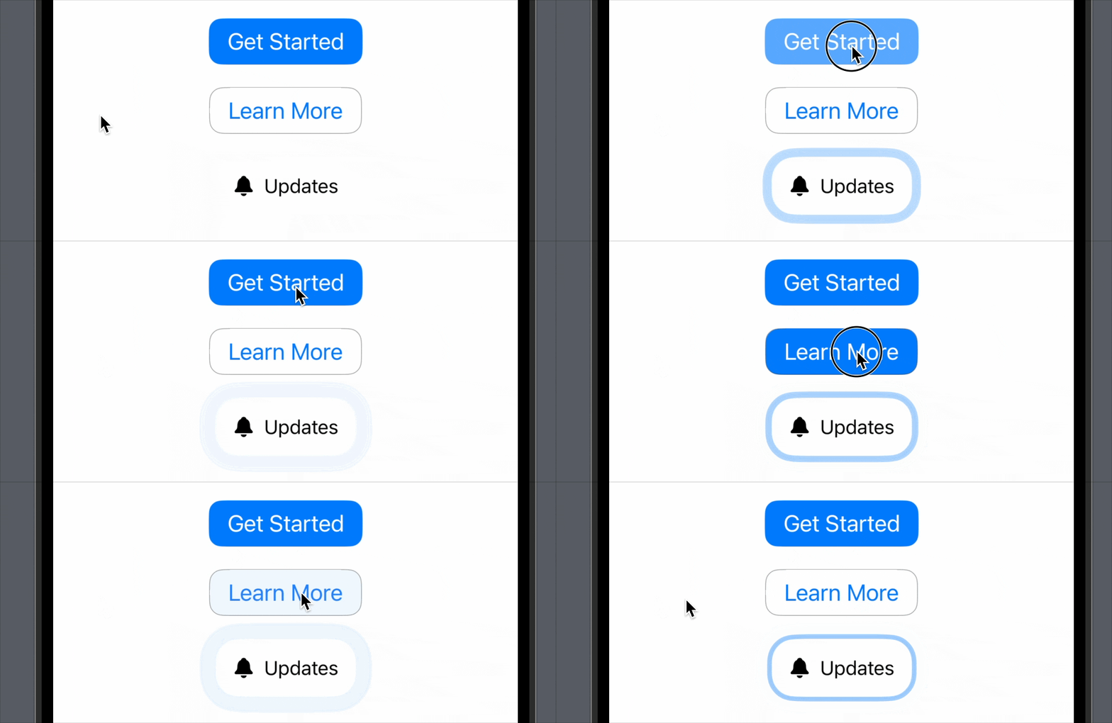
Primary, Secondary, and Pulsating Buttons
Create visually appealing buttons with pre-made styles for different use cases:
struct ButtonShowcase: View {
   var body: some View {
       VStack(spacing: 20) {
           // Primary button with prominent background
           Button("Get Started") {}
               .buttonStyle(.primary())

           // Secondary button with border
           Button("Learn More") {}
               .buttonStyle(.secondary())

           // Attention-grabbing pulsating button
           Button {} label: {
              Label("Updates", systemImage: "bell.fill")
                 .padding(15)
           }
           .buttonStyle(.pulsating(color: .blue, cornerRadius: 20, glowRadius: 8, duration: 2))
       }
   }
}
Horizontal, Vertical, Fixed Icon-Width Labels
Multiple label styles for different layout needs:
struct LabelShowcase: View {
   var body: some View {
       VStack(spacing: 20) {
           // Horizontal layout with trailing icon
           Label("Settings", systemImage: "gear")
               .labelStyle(.horizontal(spacing: 8, iconIsTrailing: true, iconColor: .blue))

           // Fixed-width icon for alignment
           Label("Profile", systemImage: "person")
               .labelStyle(.fixedIconWidth(30, iconColor: .green, titleColor: .primary))

           // Vertical stack layout
           Label("Messages", systemImage: "message.fill")
               .labelStyle(.vertical(spacing: 8, iconColor: .blue, iconFont: .title))
       }
   }
}
All parameters are optional with sensible defaults, so you can use them like .vertical(). You only need to specify what you want to customize.
Vertically Labeled Contents
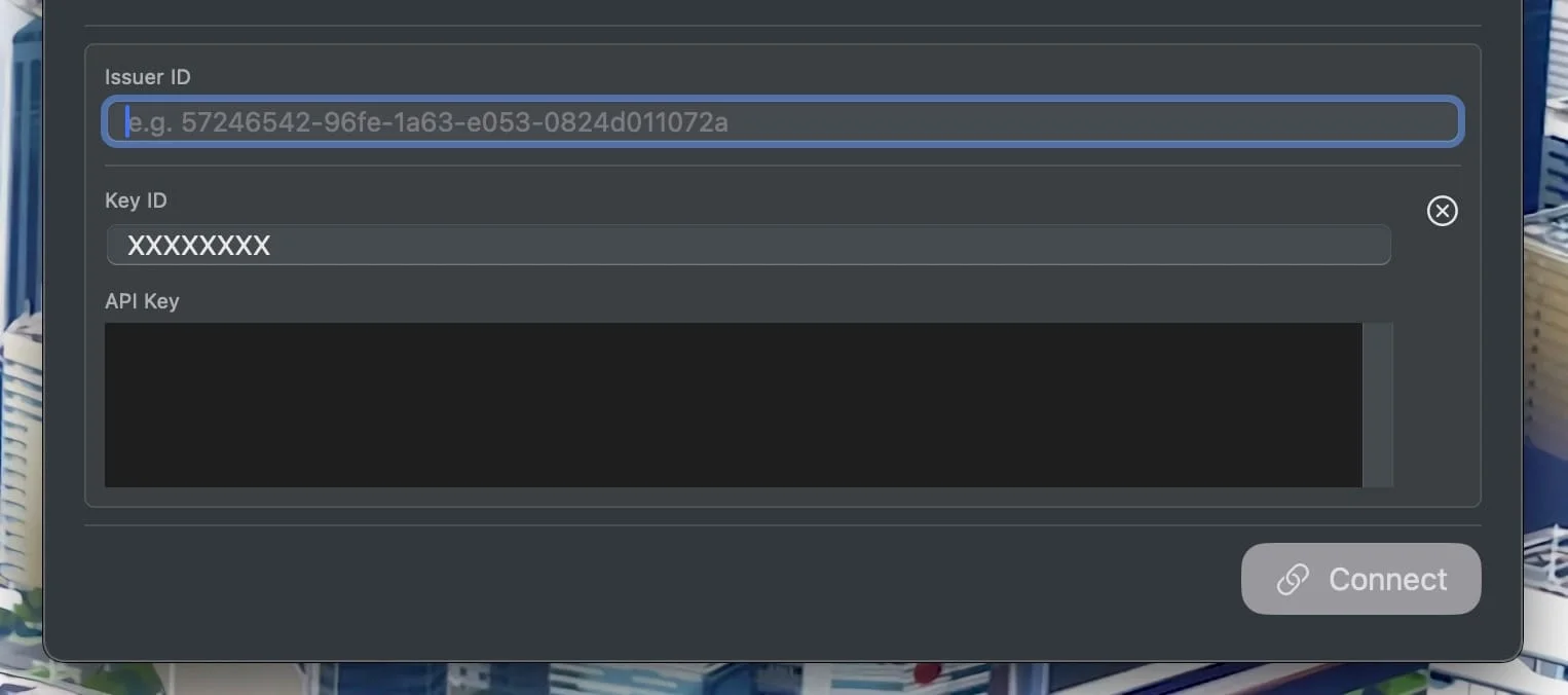
Structured form inputs with vertical labels, as used in FreemiumKit’s API configuration:
struct APIConfigView: View {
    @State private var keyID = ""
    @State private var apiKey = ""

    var body: some View {
        Form {
            HStack {
                VStack {
                    LabeledContent("Key ID") {
                        TextField("e.g. 2X9R4HXF34", text: $keyID)
                            .textFieldStyle(.roundedBorder)
                    }
                    .labeledContentStyle(.vertical())

                    LabeledContent("API Key") {
                        TextEditor(text: $apiKey)
                            .frame(height: 80)
                            .textFieldStyle(.roundedBorder)
                    }
                    .labeledContentStyle(.vertical())
                }
            }
        }
    }
}
The .vertical style allows customizing alignment (defaults to leading) and spacing (defaults to 4). Pass muteLabel: false if you’re providing a custom label style, as by default labels are automatically styled smaller and grayed out.
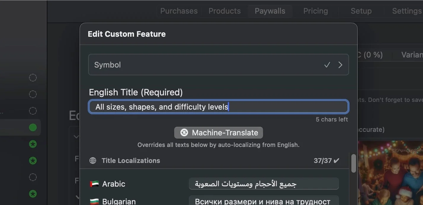
For example, in FreemiumKit’s feature localization form, I want the vertical label to have a larger font:
LabeledContent {
   LimitedTextField(
      "English \(self.title)",
      text: self.$localizedString.fallback,
      characterLimit: self.characterLimit
   )
   .textFieldStyle(.roundedBorder)
} label: {
   Text("English \(self.title) (\(self.isRequired ? "Required" : "Optional"))")
      .font(.title3)
}
.labeledContentStyle(.vertical(muteLabel: false))
Multi-Platform Toggle Style
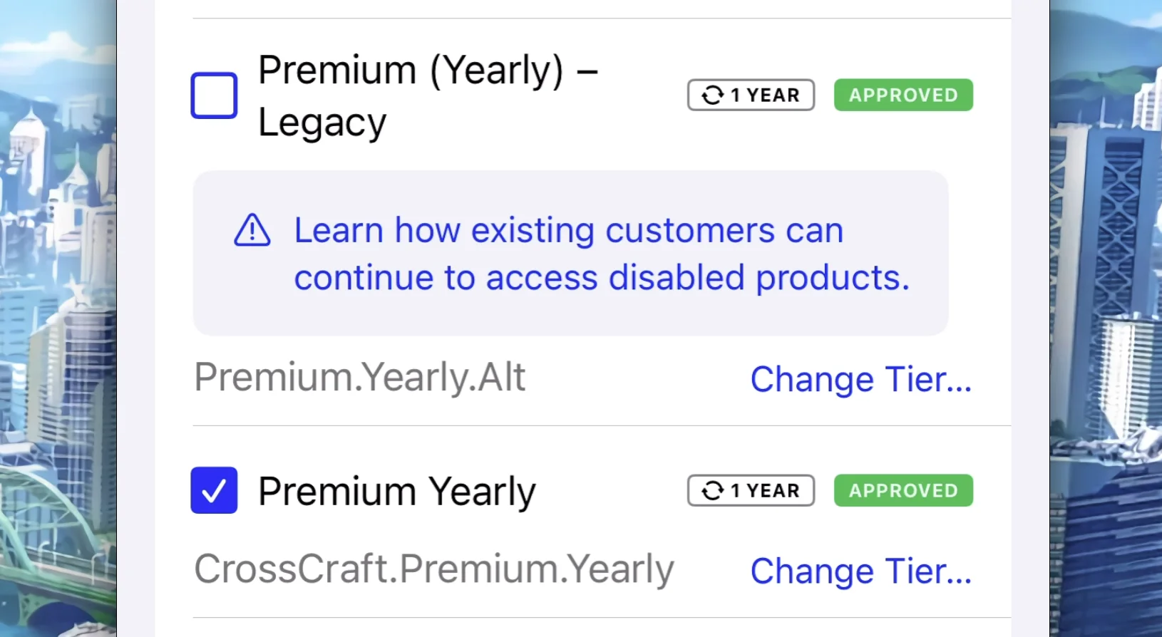
While SwiftUI provides a .checkbox toggle style, it’s only available on macOS. HandySwiftUI adds .checkboxUniversal that brings checkbox-style toggles to all platforms (rendering as .checkbox on macOS):
struct ProductRow: View {
    @State private var isEnabled: Bool = true

    var body: some View {
       HStack {
           Toggle("", isOn: $isEnabled)
              .toggleStyle(.checkboxUniversal)

           Text("Pro Monthly")

           Spacer()
       }
    }
}
The example is extracted from FreemiumKit’s products screen, which is optimized for macOS but also supports other platforms.
Get Started Today
I hope you find these styles as useful in your projects as I do in mine. If you have ideas for improvements or additional styles that could benefit the SwiftUI community, please feel free to contribute on GitHub:
github.comFlineDev / HandySwiftUIHandy SwiftUI features that didn’t make it into SwiftUI (yet)
This is the final article in a series of four exploring HandySwiftUI’s features. Check out the previous articles about New Types, View Modifiers, and Extensions if you haven’t already!

