HandySwiftUI New Types: Essential Views and Types for SwiftUI Development
From platform-specific values without #if checks to sophisticated selection controls and async state management - discover the essential SwiftUI types that helped ship apps faster. These battle-tested views and types fill common gaps in SwiftUI development.

After 4 years of iterating on these APIs in my own apps, I'm happy to share the first tagged release of HandySwiftUI. This package contains various utilities and convenience APIs that were essential in helping me ship 10 apps in the past year alone. It provides conveniences for SwiftUI development similar to how my HandySwift package does for Foundation.
In this article, I'll share a selection of the new types I've found most valuable in my daily development work across apps like TranslateKit, FreemiumKit, and CrossCraft. While HandySwiftUI contains many more utilities, these particular types have proven their worth time and time again in real-world applications and could be helpful for your SwiftUI projects as well.
Platform-Specific Values
HandySwiftUI provides an elegant way to handle platform-specific values:
struct AdaptiveView: View {
    enum TextStyle {
        case compact, regular, expanded
    }

    var body: some View {
        VStack {
            // Different number values per platform
            Text("Welcome")
                .padding(Platform.value(default: 20.0, phone: 12.0))

            // Different colors per platform
            Circle()
                .fill(Platform.value(default: .blue, mac: .indigo, pad: .purple, vision: .cyan))
        }
    }
}

Getting a similar look across platforms for a title in FreemiumKit via .font(Platform.value(default: .title2, phone: .headline)).Platform.value works with any type - from simple numbers to colors, fonts, or your own custom types. Just provide a default and override specific platforms as needed. This can be enormously useful, especially given that it even has a specific case for iPad named pad, so you can even address phones and tablets separately.
This is by far my most-used HandySwiftUI helper saving me a ton of boilerplate #if checks. It's simple but so powerful!
Readable Preview Detection
Provide fake data and simulate loading states during development:
Task {
   loadState = .inProgress

   if Xcode.isRunningForPreviews {
       // Simulate network delay in previews
       try await Task.sleep(for: .seconds(1))
       self.data = Data()
       loadState = .successful
   } else {
       do {
           self.data = try await loadFromAPI()
           loadState = .successful
       } catch {
           loadState = .failed(error: error.localizedDescription)
       }
   }
}
Xcode.isRunningForPreviews allows you to bypass actual network requests and instead provide instant or delayed fake responses in SwiftUI previews only, making it perfect for prototyping and UI development. It's also useful to avoid consuming limited resources during development, such as API rate limits, analytics events that could distort statistics, or services that charge per request – just wrap these in a if !Xcode.isRunningForPreviews check.
Efficient Image Loading
CachedAsyncImage provides efficient image loading with built-in caching:
struct ProductView: View {
    let product: Product

    var body: some View {
        VStack {
            CachedAsyncImage(url: product.imageURL)
                .frame(width: 200, height: 200)
                .clipShape(RoundedRectangle(cornerRadius: 10))

            Text(product.name)
                .font(.headline)
        }
    }
}
Note that .resizable() and .aspectRatio(contentMode: .fill) are already applied to the Image view inside it.
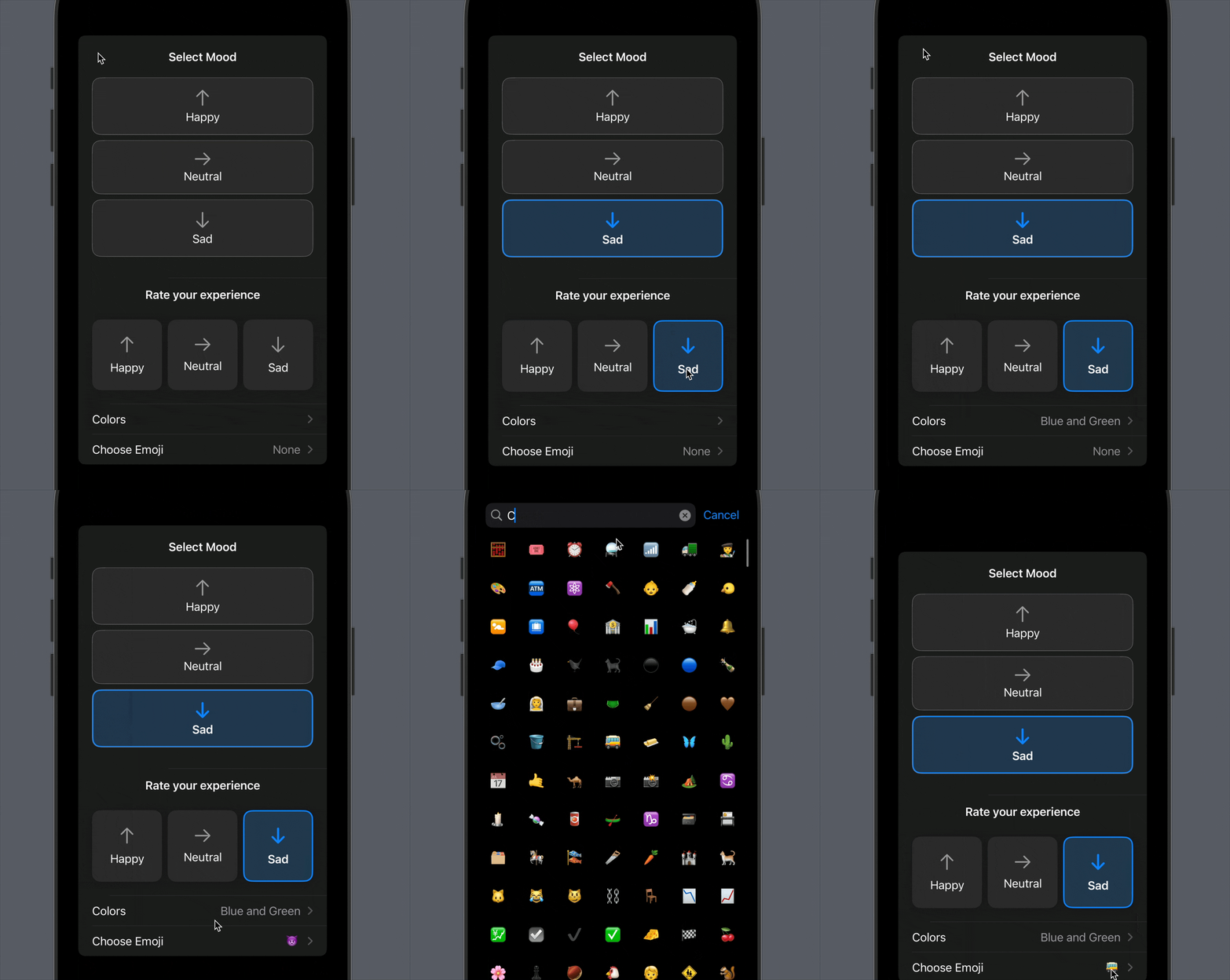
Enhanced Selection Controls
Multiple sophisticated picker types for different use cases:
struct SettingsView: View {
    @State private var selectedMood: Mood?
    @State private var selectedColors: Set<Color> = []
    @State private var selectedEmoji: Emoji?

    var body: some View {
        Form {
            // Vertical option picker with icons
            VPicker("Select Mood", selection: $selectedMood)

            // Horizontal picker with custom styling
            HPicker("Rate your experience", selection: $selectedMood)

            // Multi-selection with platform-adaptive UI
            MultiSelector(
                label: { Text("Colors") },
                optionsTitle: "Select Colors",
                options: [.red, .blue, .green],
                selected: $selectedColors,
                optionToString: \.description
            )

            // Searchable grid picker for emoji or SF Symbol selection
            SearchableGridPicker(
                title: "Choose Emoji",
                options: Emoji.allCases,
                selection: $selectedEmoji
            )
        }
    }
}

HandySwiftUI includes Emoji and SFSymbol enums that contain common emoji and symbols. You can also create custom enums by conforming to SearchableOption and providing searchTerms for each case to power the search functionality.
Async State Management
Track async operations with type-safe state handling using ProgressState:
struct DocumentView: View {
    @State private var loadState: ProgressState<String> = .notStarted

    var body: some View {
        Group {
            switch loadState {
            case .notStarted:
                AsyncButton("Load Document") {
                    loadState = .inProgress
                    try await loadDocument()
                    loadState = .successful
                } catchError: { error in
                    loadState = .failed(error: error.localizedDescription)
                }

            case .inProgress:
                ProgressView("Loading document...")

            case .failed(let errorMessage):
                VStack {
                    Text("Failed to load document:")
                        .foregroundStyle(.secondary)
                    Text(errorMessage)
                        .foregroundStyle(.red)

                  AsyncButton("Try Again") {
                      loadState = .inProgress
                      try await loadDocument()
                      loadState = .successful
                  } catchError: { error in
                      loadState = .failed(error: error.localizedDescription)
                  }
                }

            case .successful:
                VStack {
                    DocumentContent()
                }
            }
        }
    }
}
The example demonstrates handling all states in a type-safe way:
.notStartedshows the initial load button.inProgressdisplays a loading indicator.failedshows the error with a retry option.successfulpresents the loaded content
Bring NSOpenPanel to SwiftUI
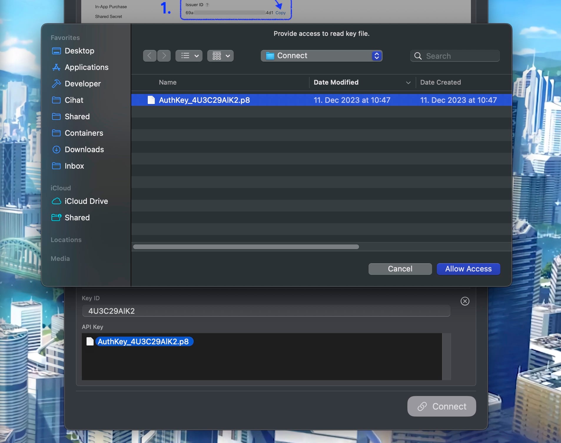
Bridging native macOS file access into SwiftUI, particularly useful for handling security-scoped resources:
struct SecureFileLoader {
    @State private var apiKey = ""

    func loadKeyFile(at fileURL: URL) async {
        #if os(macOS)
        // On macOS, we need user consent to access the file
        let panel = OpenPanel(
            filesWithMessage: "Provide access to read key file",
            buttonTitle: "Allow Access",
            contentType: .data,
            initialDirectoryUrl: fileURL
        )
        guard let url = await panel.showAndAwaitSingleSelection() else { return }
        #else
        let url = fileURL
        #endif

        guard url.startAccessingSecurityScopedResource() else { return }
        defer { url.stopAccessingSecurityScopedResource() }

        do {
            apiKey = try String(contentsOf: url)
        } catch {
            print("Failed to load file: \(error.localizedDescription)")
        }
    }
}

The example taken right out of FreemiumKit demonstrates how OpenPanel simplifies handling security-scoped file access for dragged items on macOS while maintaining cross-platform compatibility.
Vertical Tab Navigation
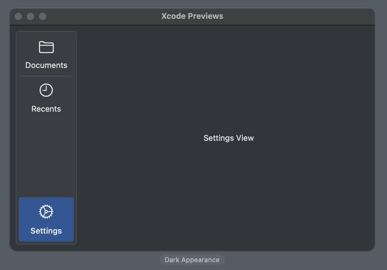
An alternative to SwiftUI's TabView that implements sidebar-style navigation commonly seen in macOS and iPadOS apps:
struct MainView: View {
    enum Tab: String, CaseIterable, Identifiable, CustomLabelConvertible {
        case documents, recents, settings

        var id: Self { self }
        var description: String {
            rawValue.capitalized
        }
        var symbolName: String {
            switch self {
            case .documents: "folder"
            case .recents: "clock"
            case .settings: "gear"
            }
        }
    }

    @State private var selectedTab: Tab = .documents

    var body: some View {
        SideTabView(
            selection: $selectedTab,
            bottomAlignedTabs: 1  // Places settings at the bottom
        ) { tab in
            switch tab {
            case .documents:
                DocumentList()
            case .recents:
                RecentsList()
            case .settings:
                SettingsView()
            }
        }
    }
}

SideTabView provides a vertical sidebar with icons and labels, optimized for larger screens with support for bottom-aligned tabs. The view automatically handles platform-specific styling and hover effects.
Get Started Today
I hope you find these types as useful in your projects as I do in mine. If you have ideas for improvements or additional types that could benefit the SwiftUI community, please feel free to contribute on GitHub:
This is the first in a series of four articles exploring HandySwiftUI's features. Stay tuned for upcoming posts about View Modifiers, Extensions, and Styles!
A simple & fast AI-based translator for String Catalogs & more.
Get it now and localize your app to over 100 languages in minutes!

