HandySwiftUI Extensions: Making SwiftUI Development More Convenient
Discover powerful SwiftUI extensions for clean optional bindings, intuitive color management, XML-style text formatting, and more. These battle-tested utilities will help you write more elegant SwiftUI code while reducing boilerplate in your apps.

After 4 years of iterating on these APIs in my own apps, I'm happy to share the first tagged release of HandySwiftUI. This package contains various utilities and convenience APIs that were essential in helping me ship 10 apps in the past year alone. It provides conveniences for SwiftUI development similar to how my HandySwift package does for Foundation.
In this article, I'll share a selection of the extensions I've found most valuable in my daily development work across apps like TranslateKit, FreemiumKit, and CrossCraft. While HandySwiftUI contains many more utilities, these particular extensions have proven their worth time and time again in real-world applications and could be helpful for your SwiftUI projects as well.
Optional Binding Conveniences
The ?? and ! operators and the isPresent modifier simplify working with optional values in bindings:
struct EditableProfile: View {
   @State private var profile: Profile?
   @State private var showAdvanced = false

   var body: some View {
       Form {
           // Provide default value for optional binding using the `??` operator
           TextField("Name", text: $profile?.name ?? "Anonymous")

           // Negate binding value using `!` operator
           Toggle("Hide Details", isOn: !$showAdvanced)
       }
       // Use optional binding for sheet presentation
       .sheet(isPresented: $profile.isPresent(wrappedType: Profile.self)) {
           ProfileEditor(profile: $profile)
       }
   }
}
The operators are useful in all kinds of views, when working with optional data in models, for example.
Color Management
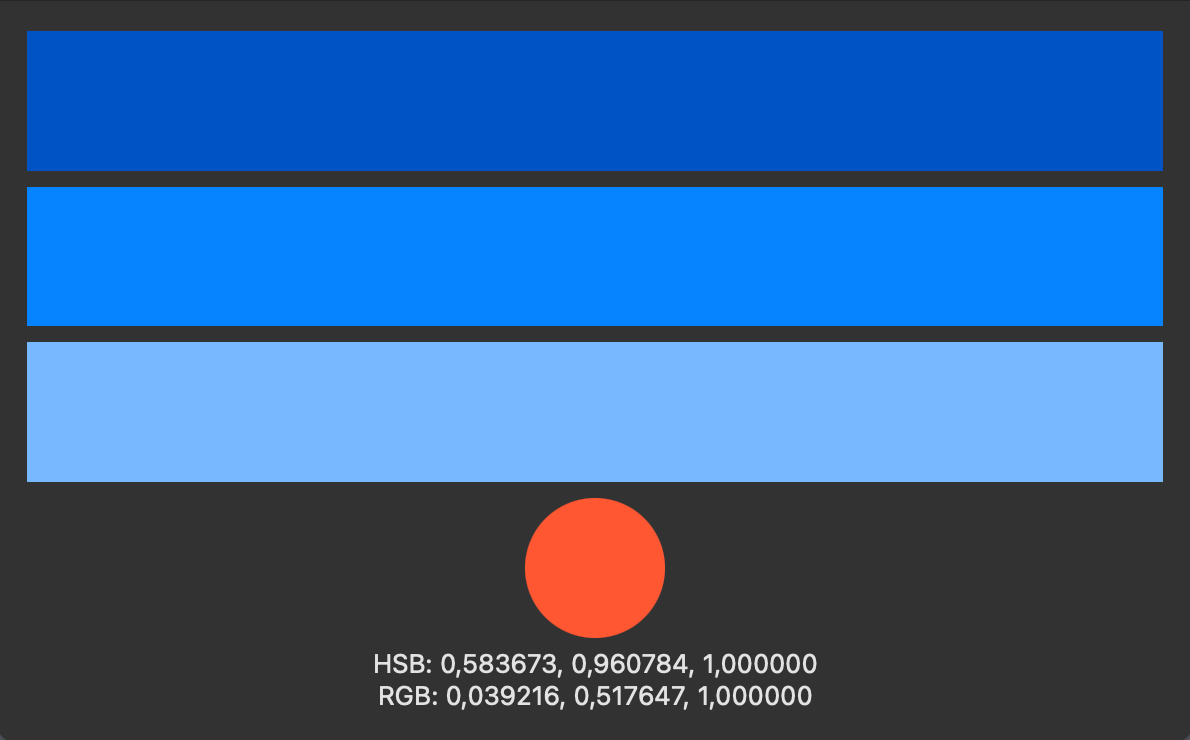
The comprehensive color extensions provide powerful tools for color manipulation and system color adoption:
struct ColorfulView: View {
   @State private var baseColor = Color.blue

   var body: some View {
       VStack {
           // Create variations of the base color
           Rectangle()
               .fill(baseColor.change(.luminance, by: -0.2))
           Rectangle()
               .fill(baseColor)
           Rectangle()
               .fill(baseColor.change(.luminance, by: 0.2))

           // Work with hex colors
           Circle()
               .fill(Color(hex: "#FF5733"))

           // Use color components
           Text("HSB: \(baseColor.hsbo.hue), \(baseColor.hsbo.saturation), \(baseColor.hsbo.brightness)")
           Text("RGB: \(baseColor.rgbo.red), \(baseColor.rgbo.green), \(baseColor.rgbo.blue)")
       }
       .padding()
       // Use semantic system colors for custom system-like components
       .background(Color.systemBackground)
   }
}

When adjusting color brightness, use .luminance instead of .brightness from the HSB color system. Luminance better represents how humans perceive light and dark, which is why HandySwiftUI includes support for the HLC color space.
Rich Text Formatting
The text formatting extensions provide a convenient way to create rich text with mixed styles inspired by XML-style tags:
struct FormattedText: View {
   var body: some View {
       Text(
           format: "A <b>bold</b> new way to <i>style</i> your text with <star.fill/> and <b>mixed</b> <red>formatting</red>.",
           partialStyling: Dictionary.htmlLike.merging([
               "red": { $0.foregroundColor(.red) },
               "star.fill": { $0.foregroundColor(.yellow) }
           ]) { $1 }  // returning $1 (instead of $0) means added keys override (potentially) existing keys
       )
   }
}

In the above example, the built-in .htmlLike styling that ships with HandySwiftUI is combined with custom tags. Note that .htmlLike simply returns this:
[
   "b": { $0.bold() },
   "sb": { $0.fontWeight(.semibold) },
   "i": { $0.italic() },
   "bi": { $0.bold().italic() },
   "sbi": { $0.fontWeight(.semibold).italic() },
   "del": { $0.strikethrough() },
   "ins": { $0.underline() },
   "sub": { $0.baselineOffset(-4) },
   "sup": { $0.baselineOffset(6) },
]
Any XML-like entries that end with a /> such as <star.fill/> from the example above get rendered as an SFSymbol. This way, you can easily use SFSymbols right within your text.
Image Handling
Unified extensions for image processing for UIImage and NSImage:
class ImageProcessor {
   func processImage(_ image: UIImage) {
       // Resize image while maintaining aspect ratio
       let resized = image.resized(maxWidth: 800, maxHeight: 600)

       // Convert to different formats
       let pngData = image.pngData()
       let jpegData = image.jpegData(compressionQuality: 0.8)
       let heicData = image.heicData(compressionQuality: 0.8)
   }
}
Note that all these APIs return optional values for edge cases like when the system is extremely low on memory, but should succeed most of the time.
Convenient Model-to-View Conversions
HandySwiftUI provides initializer conveniences that make it easy to display your model types directly in SwiftUI views:
enum Tab: CustomLabelConvertible {
    case home, profile, settings

    var description: String {
        switch self {
        case .home: "Home"
        case .profile: "Profile"
        case .settings: "Settings"
        }
    }

    var symbolName: String {
        switch self {
        case .home: "house.fill"
        case .profile: "person.circle"
        case .settings: "gear"
        }
    }
}

struct ContentView: View {
    @State private var selectedTab: Tab = .home

    var body: some View {
        TabView(selection: $selectedTab) {
            HomeView()
                // Create tab item directly from enum case
                .tabItem { Label(convertible: Tab.home) }
                .tag(Tab.home)

            ProfileView()
                .tabItem { Label(convertible: Tab.profile) }
                .tag(Tab.profile)

            SettingsView()
                .tabItem { Label(convertible: Tab.settings) }
                .tag(Tab.settings)
        }

        // Works with Text and Image views too
        Text(convertible: selectedTab)  // Shows tab name
        Image(convertible: selectedTab) // Shows tab icon
    }
}
Instead of manually extracting strings and symbol names from your models, you can conform them to CustomStringConvertible for text, CustomSymbolConvertible for SF Symbols, or CustomLabelConvertible for both. Then use the convenient initializers to create SwiftUI views directly:
Text(convertible:)- Creates text from anyCustomStringConvertibleImage(convertible:)- Creates SF Symbol images from anyCustomSymbolConvertibleLabel(convertible:)- Creates text+icon labels from anyCustomLabelConvertible
This pattern works especially well with enums representing UI states, menu options, or tabs, as shown in the example above.
Search Prefix Highlighting
HandySwiftUI provides an elegant way to highlight matching text in search results, making it easy to show users exactly what parts of the text matched their search query:
struct SearchResultsView: View {
    @State private var searchText = ""
    let translations = [
        "Good morning!",
        "Good evening!",
        "How are you?",
        "Thank you very much!"
    ]

    var body: some View {
        List {
            ForEach(translations.filtered(by: searchText), id: \.self) { translation in
                // When searching for "go mo", highlights "Go mo" in "Good morning!"
                Text(translation.highlightMatchingTokenizedPrefixes(in: searchText))
            }
        }
        .searchable(text: $searchText)
    }
}

extension [String] {
    func filtered(by searchText: String) -> [String] {
        guard !searchText.isEmpty else { return Array(self) }
        return filter { $0.localizedCaseInsensitiveContains(searchText) }
    }
}

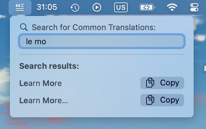
This highlighting feature was originally developed for TranslateKit's menu bar "Common Translations" feature, where it helps users quickly spot matching phrases in confirmed translations. The function breaks down the search text into tokens and highlights each matching prefix, making it perfect for:
- Search result highlighting in lists or menus
- Autocomplete suggestions with visual feedback
- Filtering through text collections while showing match context
- Making search matches more visible in document previews
The highlighting is case-insensitive and diacritic-insensitive by default, but you can customize the locale and font used for highlighting. This makes it a versatile tool for any search interface where you want to emphasize matching portions of text.
Get Started Today
I hope you find these extensions as useful in your projects as I do in mine. If you have ideas for improvements or additional extensions that could benefit the SwiftUI community, please feel free to contribute on GitHub:
This is the third in a series of four articles exploring HandySwiftUI's features. Check out the previous articles about New Types and View Modifiers if you haven't already, and stay tuned for the final post about Styles!
A simple & fast AI-based translator for String Catalogs & more.
Get it now and localize your app to over 100 languages in minutes!

